Tuesday, December 17, 2013

Final Assignment! (Paint To Music)

Oh how time flies fast! So here's the last post for this blog...

We had to paint on 2 canvases, a 50 x 60cm and a 60 x 90cm one, to 2 types of music playlist, a classical one and contemporary one. Truth be told, I much preferred the classical music...

Here were some challenges faced:
  1. contacting the supplier to get the canvases ready
  2. trying to communicate with the coursemates and lecturer (a few blunders for this one, oops)
  3. painting spontaneously with all sorts of mediums and techniques
Overall, however, this activity served an important lesson to me as a designer in terms of working fast, under pressure, and with a large group. It's been a rewarding learning experience, nonetheless.


My painting for the contemporary playlist on the 60 x 90cm canvas

My painting for the classical playlist on 50 x 60cm canvas, done with acrylics, spray paint, and pastels.

Annabel posing with my art because it oddly captured her essence in it! :)

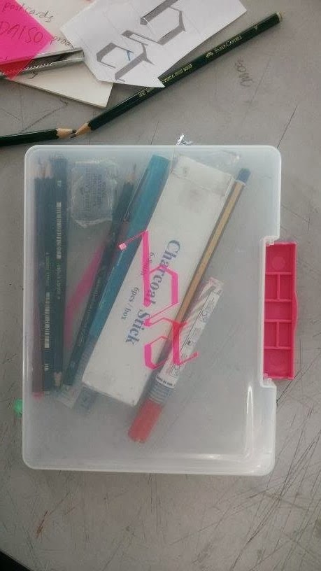
Some of the tools I used!

Jean's artwork, all stencil, except with some gold accents. I love!

Fauza's painting. Almost reminiscent of a Pollock. One of my favs!

— Hidayah

Sunday, December 8, 2013

Batik Trip!

Hello everyone! This will probably be one of my last posts here, aww :( We've almost concluded our foundation, oh how time flies...  anyways, here's my blog post about the batik trip!

This assignment was a group project and involved us in taking an excursion to a real batik workshop! We assigned ourselves into groups of four, and I ended up with Fauza, Farah, and Eka. Our theme was inspired by Alice in Wonderland's dresses, but with our own twists to it.

I must say, I wish I had more practise with batik, because it was really challenging to do without experience, but now I am interested to visit Jadi Batek again!

Here are the dresses that inspired us:


Now, what is batik? According to google, batik is a method (originally used in Java) of producing coloured designs on textiles by dyeing them, having first applied wax to the parts to be left undyed.

here is the hot, melted wax we used to draw our designs on the silk fabric.

Here is the 'canting' a tool which is used to distribute the wax, like a pen. We had to refill it again and again because the wax ran out and cooled off fast!

Batik paintings for sale at the workshop.

A professional at work, she also helped us with out batik-ing process! She was a lovely lady, so friendly!

Work in progress to be sold at the souvenir shop!

We left the workshop with smiles. Fauza and I!

before...
after...

Their finished works. very gorgeous!

Our batik-ing process

Exhibition day!

our works, Eka, Farah, mine and Fauza's.

— Hidayah

Sunday, November 10, 2013

Wednesday, October 30, 2013

Monogram + Stencil Assignment

The stencils I made after spraying them.

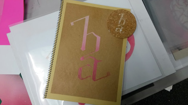
Hey everyone! Here's what I managed to come up with for the assignment. I haven't finished stencilling all my things but here's what my progress so far. I used spray paint and spray mount for all the items.

I sprayed it ombre/gradient style and was quite pleased with the result!


A5 folder!

graffiti style notebook

BRAAAAAAAINS!

A4 clear files!

Sketchbook and a coaster

Cardboard artwork


— Hidayah

Sunday, October 27, 2013

Monogram Assignment Part 1

*blows off virtual dust on this blog*

For our major assignment, we were instructed to design a monogram.

Now... what IS a monogram? Most people refer to it as a simple logo, but there is much more to it. It requires a strong sense of spatial intelligence and a good eye for design to come up with. Its definition will tell you why this is so...


Here are progress shots from this week:

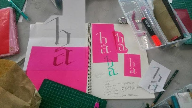
stencil cuttings!

laying out the cut pieces to see what it would look like.

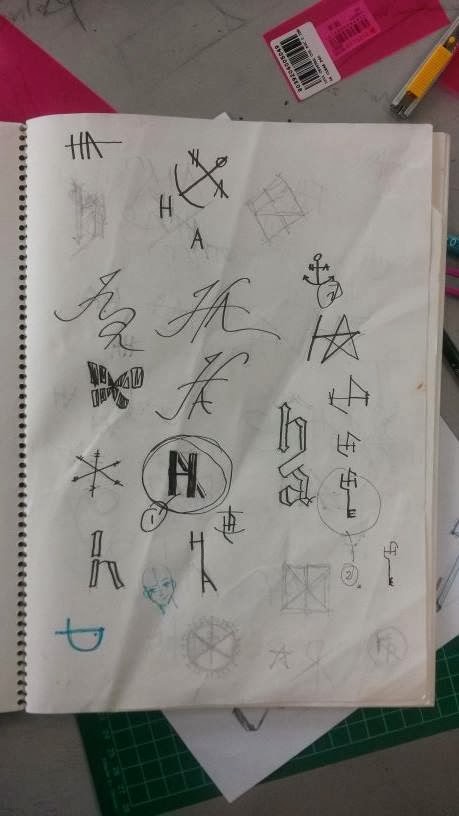
initial sketches ft. Jamie's logo cameo

the rejected designs
Stencil tryouts:


Stay tuned for more!

— Hidayah

Monday, October 14, 2013

What's Your Square?

Something clockwork this way comes.

This is our second assignment since the self portrait. It was done over a span of two weeks with an in class activity, tutorial and finally, a presentation.

The assignment given required us to come up with a minimum of two paper cut outs. Each square had to be:
  • at least 6" x 6"
  • mounted on a minimum sized A3 board
  • cut out using a blade, and no pieces were to be thrown away
  • of a central theme with two artworks encompassing symmetry and movement

After spending a few minutes on the ideation process, I finally settled on my theme:

Gears!

We were instructed to do a test run and this is what I came up with at the end of the day. This artpiece reflected movement, but had a bit of an element of symmetry.

I then came up with these designs: A revision of my first artwork, and a mechanical butterfly.


Since I finished my assignment early, I created a title card for my artwork and a third cut out which had both symmetry and movement, but focused more on compositional balance and playing around with the fulcrum.

Here's my display! Credits to Farah :)


— Hidayah

Monday, September 16, 2013

Floating Exhibit and Lantern Making

This project involved planning over a span of 7 weeks, but is currently put on hold, sadly due to time and lack of funds. It was relevant 2 assignments, so we're still on schedule!

There were many learning outcomes we faced from this project, and they are:
  1. efficient project planning
  2. fair delegation of teamwork
  3. cooperation
  4. creativity and innovation skills
  5. stepping out of the comfort zone
Here are the tasks that were involved with the project:
  • Week 2 : Prepare proposal and initial planning
  • Week 3 : Presentation of theme and ideas by leaders and team members
  • Week 4 : Proposal of artworks for floating boards and stencils
  • Week 5 : Stencil making and critique
  • Week 6 : Lantern making
  • Week 7 : Stenciling
Here are the abstract squares I made!


Here are the stencils I designed. I learned a lot from this project, especially since I was elected as one of the chairpersons. 2 of my designs were rejected, and here were the 3 finalised ones cut from acetate transparency:

Wow, it's a wau!

A keris :D

My initial design for the keris, In front of a bulan sabit and star!


— Hidayah